PERSONAL FINANCE iOS & ANDROID APP
A Hassle-Free Mobile Experience for Security Benefit
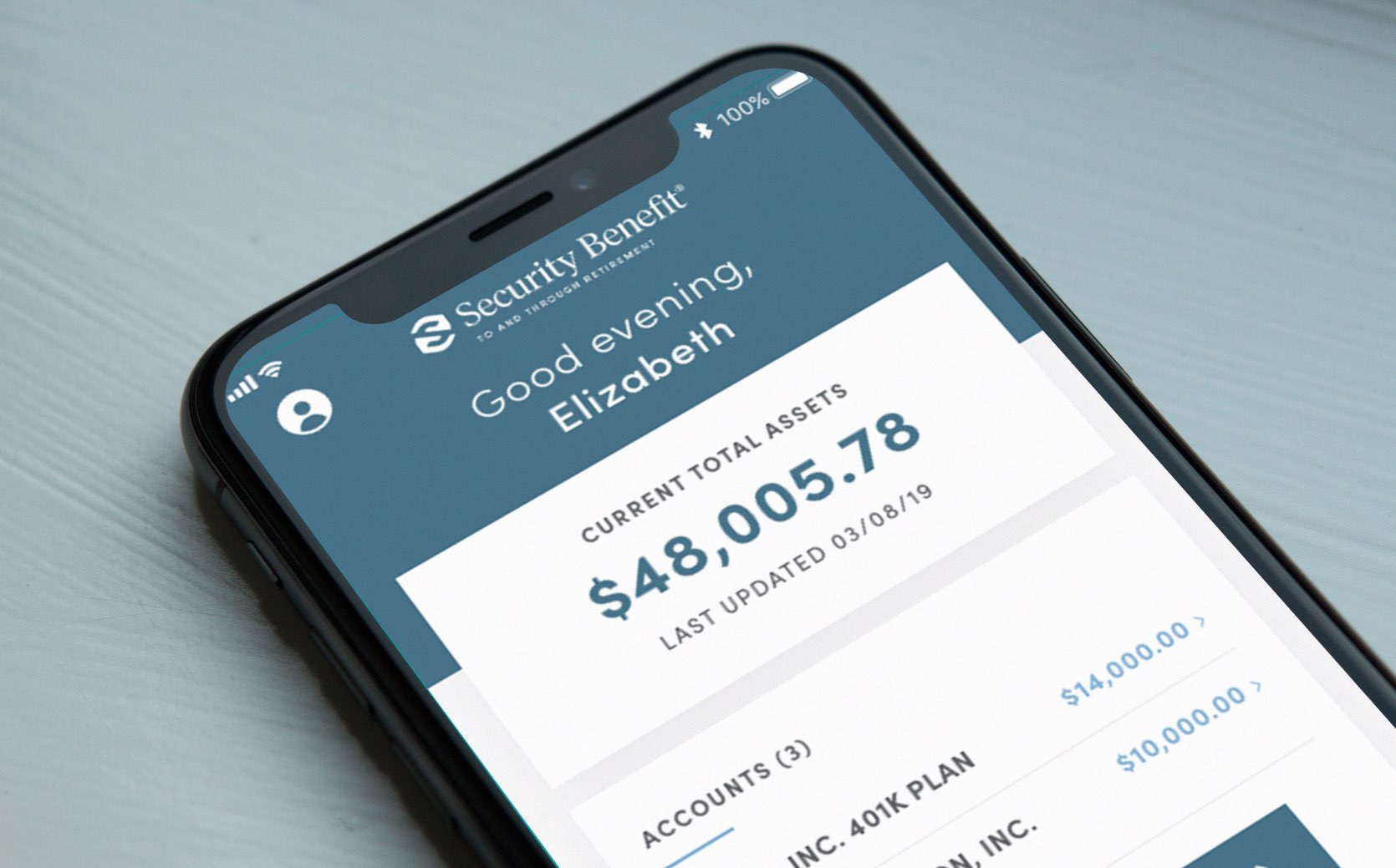
Security Benefit, a leading retirement solutions provider, needed a mobile app to remain competitive in its industry. The main goal of the app is to make personal finances easy and accessible for its customers no matter their background and financial knowledge.
We designed a mobile app experience that is visually engaging and intuitive to use in both iPhone and Android. Through the app, users can perform all their banking and money management easily. The design revolved around making complex financial processes such as getting a loan, investing money, and planning for retirement hassle-free.
ROLE & DELIVERABLES
UI Designer
- Competitive Analysis
- UI Style Exploration
- UI Design
- High fidelity prototyping
- User testing
- Handoff to development
UX Challenges
Making online banking simple & engaging
UX Challenges
Differentiating GMB from Follow-Along Workout Programs
- The financial services and processes are complex and convoluted, and the average user is not familiar with basic money management principles. How do we provide enough information to make an informed decision without creating an overwhelming experience?
- Financial tools aren’t the most exciting products to use—they can feel cold, boring, and corporate.
- The user experience needs to not only fulfill user needs, but also comply with regulatory, legal, and security requirements of the industry.
Optimized flows to simplify complex processes
The Security Benefit mobile app supports complex financial management processes including: calculating loans and retirement projections, withdrawing funds, managing investments, assigning beneficiaries, and monitoring account activity. The app’s design transforms these complicated processes into a simple and smooth flows that fit into a phone screen.
Wizards reduce cognitive overload by splitting up a complex task into smaller steps and create a gradual structure with a clear path forward. Clear labeling indicates where the user is in the process and also where and when users are required to provide input or move forward. The interface uses constant feedback, contextual error messages, and clear actions for users to take to create a guided experience. For example, next buttons are only active after users have provided all the required information so it is clear when a user can move on to the next step.
Designing a Powerful and Intuitive Video Player Through Testing and Iterating
In order to bring GMB video training programs to life, we had to pay special attention to the design of the heart of the product: the video player. In addition to the standard video player controls like play, pause, fast forward and rewind, we had to incorporate other controls such as exercise timers and countdowns, skip or return to exercise, and view full demo videos. How do we avoid a crowded interface, specially on mobile devices?
It was especially important to consider the context of use and device orientation. The app would be used at home or at the gym while the user is working out. We user tested and iterated on the video player feature to ensure the right amount of control while limiting the number of required interactions with the device. We tested the video player and made adjustments to ensure ease of use.
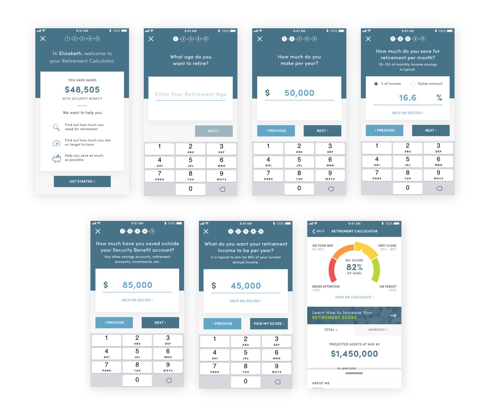
Example of Wizard- Retirement Calculator
Providing the right amount of information at the right time
One overarching goal was to provide any user—regardless of their background —all the information necessary to make wise investment decision. However, being bombarded with tons of complex financial information can be overwhelming. A crucial part of the experience was defining the time and manner in which the information is provided.
Rather than providing excess information in one screen all at once, the interface uses links, expand and collapse interactions, and tooltips that user can select to see or skip. This way we avoided cognitive overload and users could read up on anything they didn’t understand or need additional information on. The design favors a gradual discovery process and the user is in control of digging as far as they want into information regarding a topic.
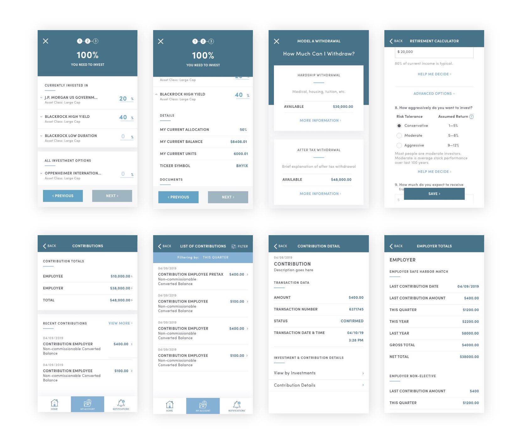
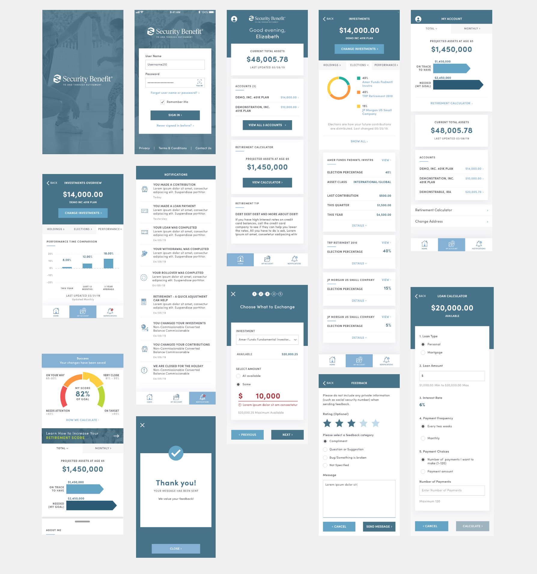
Examples of expand-collapse, advanced options, and links for additional information throughout the Security Benefit mobile app to create a less overwhelming and more approachable experience.
Creating a visually engaging experience
After reviewing the designs of other players in the industry, it was clear a lot of them use bland color palettes and clunky interactions. This does not achieve the approachable feeling that was so important for the Security Benefit team. I selected an open typeface that feels friendly and easy to read. We had to use the established brand color palette which felt a bit corporate, but combining it with other visual elements, such as illustrations and cards, we ensured that the interface felt clean, but not extremely formal or intimidating.
Data visualization is a key element in the interface design
Parsing financial data into easy-to-read, comprehensible graphs, charts, and reports allows to display large amounts of data and statistics in an easy-to digest manner. The designs were scalable and readable, logically built with a functional color scheme and not too overloaded with data. I designed a style guide that can be used to scale the app design as Security Benefit transitions into more digital services and products.
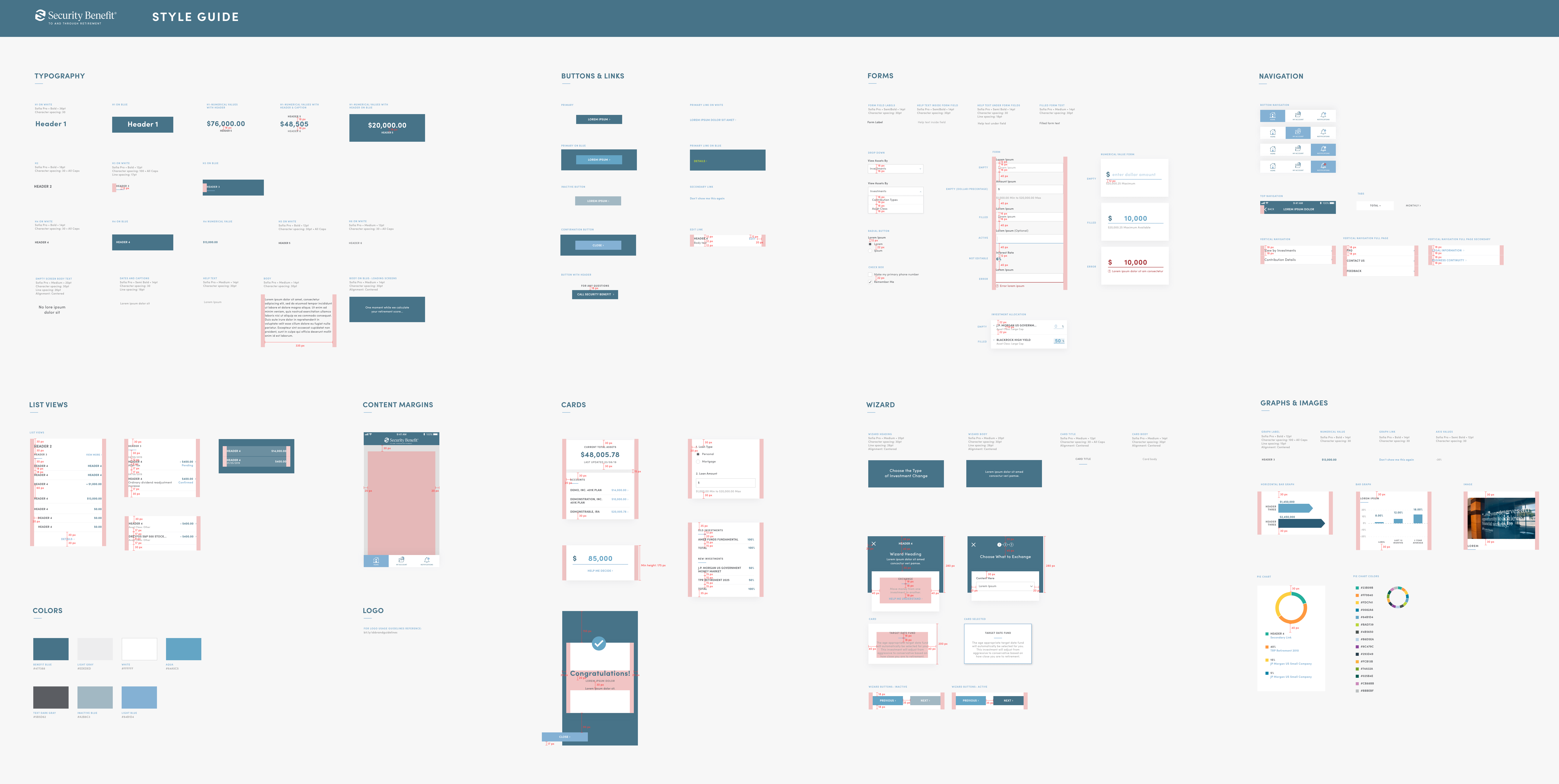
Security Benefit Style Guide
Selected Works
Mariana Herrera-PortfolioWeb App
XIX EntryUI/UX Design
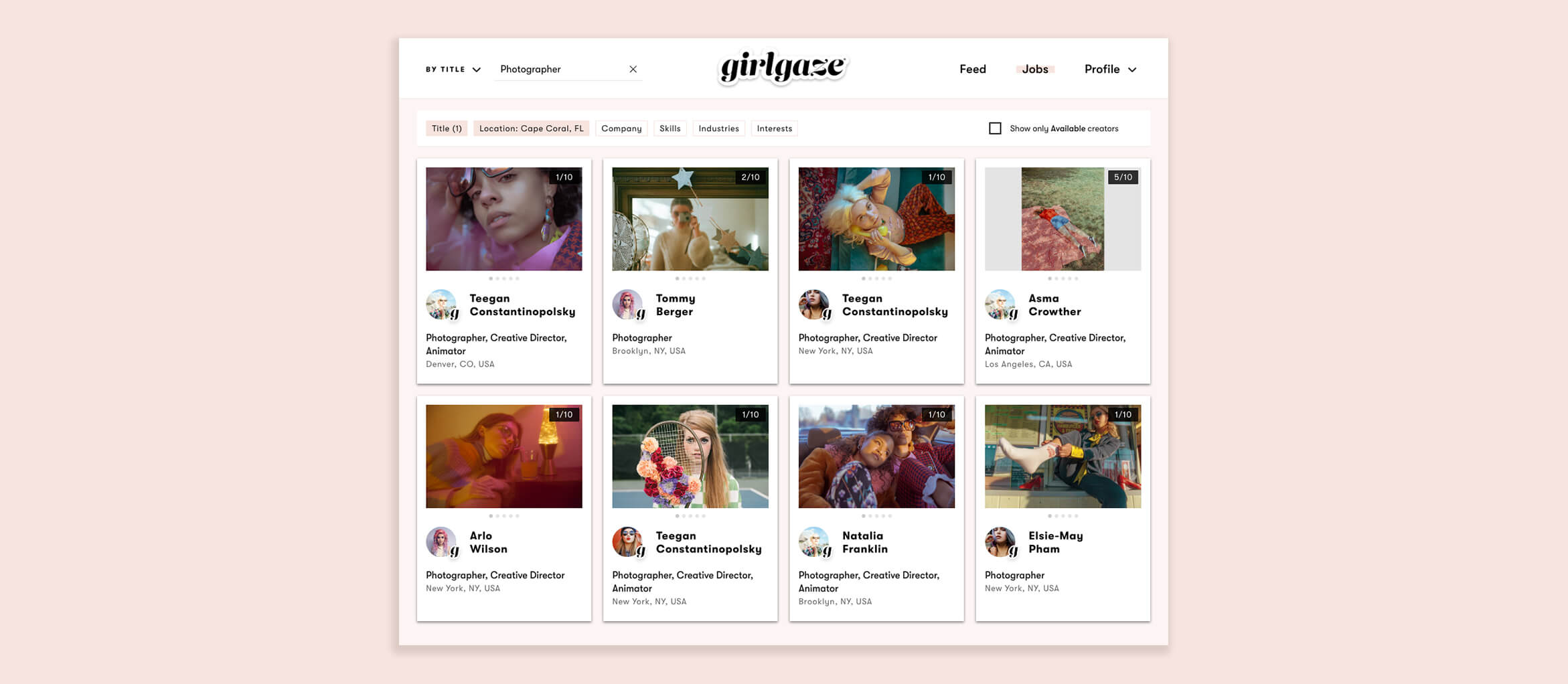
Mariana Herrera-PortfolieWeb App
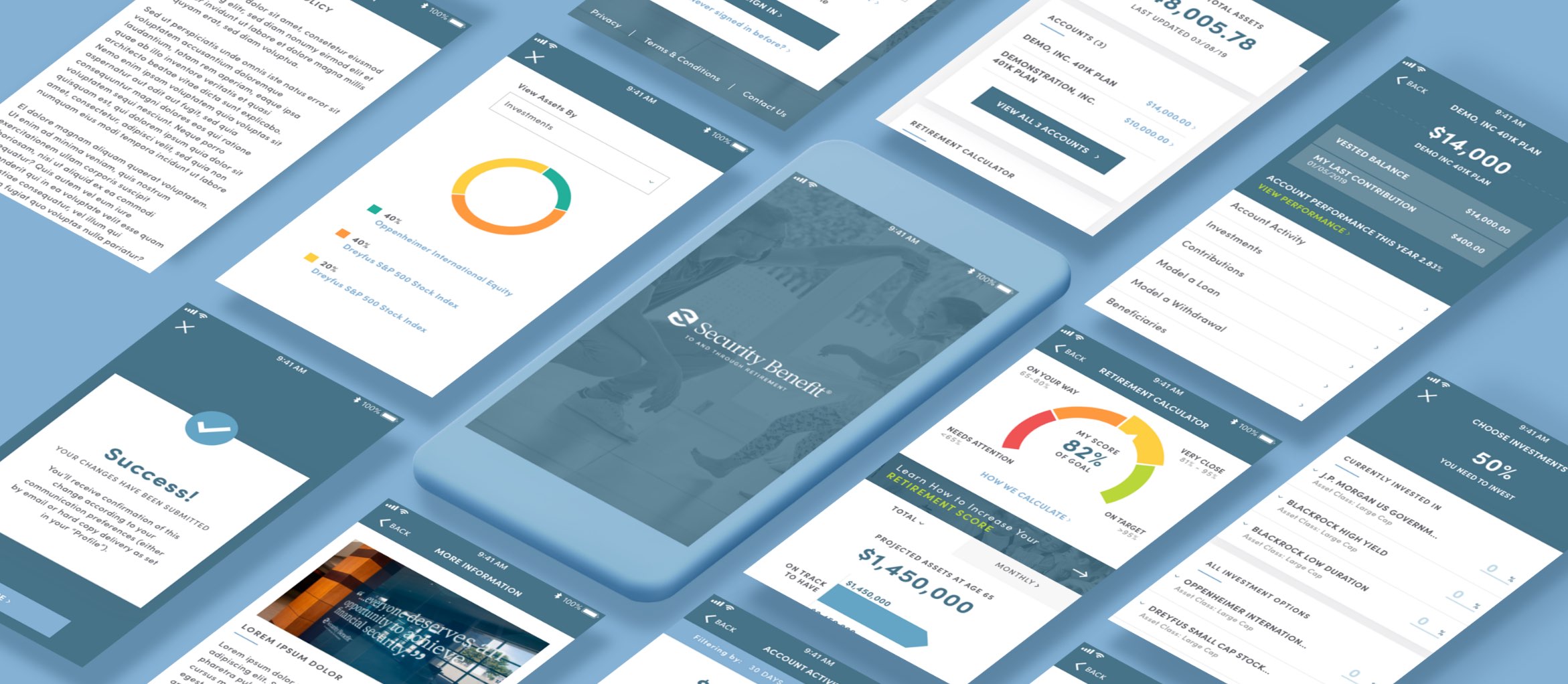
Mariana Herrera-PortfolioMobile App-iOS & Android
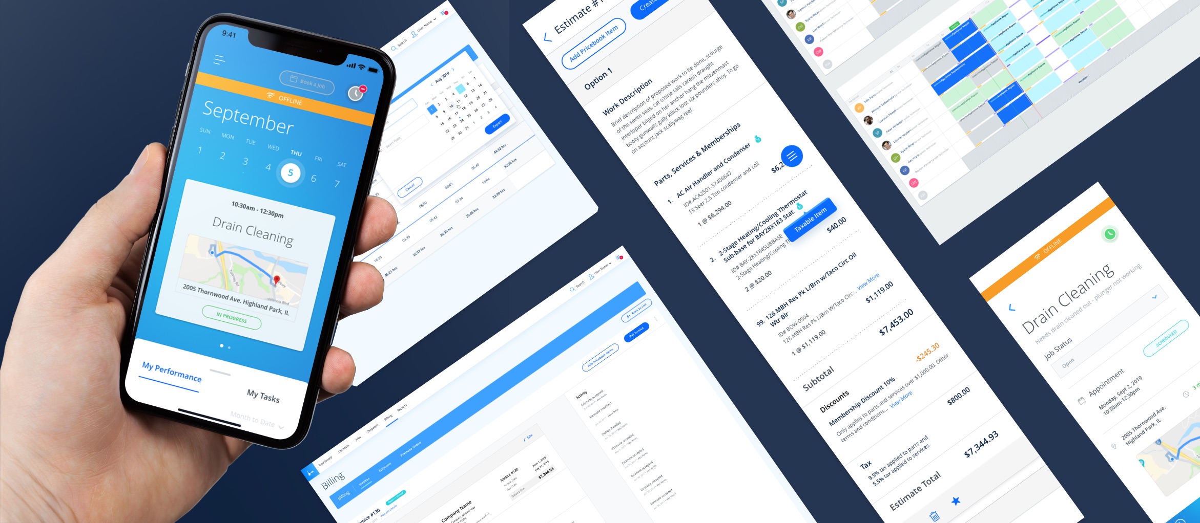
Mariana Herrera-PortfolioMobile and Web App
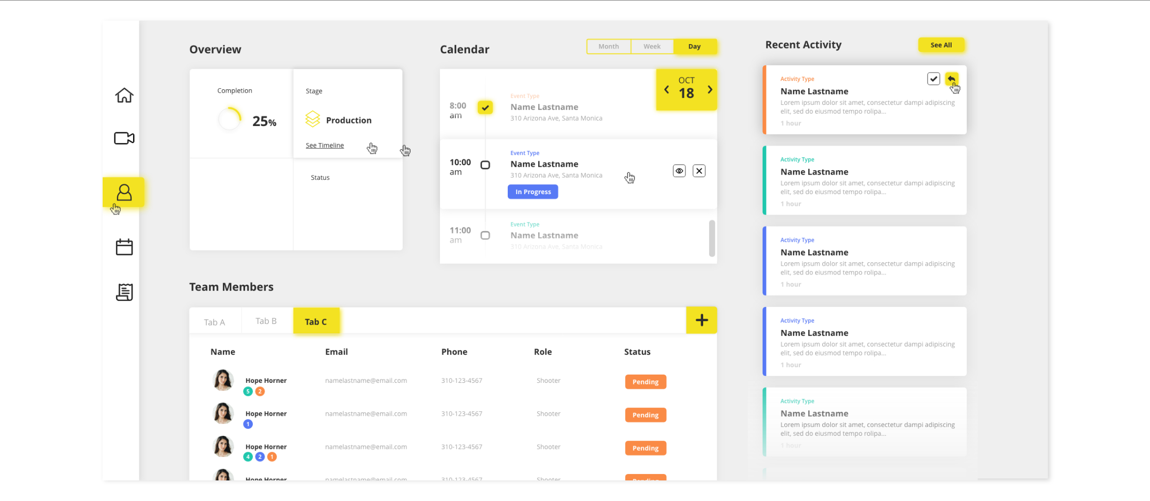
Mariana Herrera-PortfolioUI Design

Mariana Herrera-PortfolioMobile App
Mariana Herrera-PortfolioWebsite
